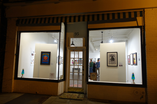
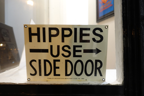
My wife Alex and I had great fun last week, attending the opening of the Bahr Gallery in Oyster Bay, a new gallery devoted to classic 1960s psychedelic rock posters, many of which are lasting and iconic images of that time.
Symmetrical lava lamps in the show windows flank the front door to the Bahr Gallery.
The gallery is right next door to 20th Century Cycles, Billy Joel’s motorcycle and auto museum, and across the street from one of the newest and hippest restaurants in once sleepy Oyster Bay, 2 Spring.
Suddenly Oyster Bay, long the exclusive province of its most famous dead resident, Teddy Roosevelt, is coming to life after a century long slumber.
“Break on Through to the Other Side”—need I say more?
Artist: Victor Moscoso, 1967
Avalon Ballroom, San Franscisco
Bands: The Doors, Sparrow, Country Joe & the Fish
Ted Bahr is the owner of the gallery (and on the board of Alex’s organization, Preservation Long Island) and retired from his long career, most recently as the CEO and President of BZ Media, which he sold.
While too young to have experienced the acid rock of the 1960s firsthand, he recalls longingly looking back at it a decade later during his years growing up in the 1970s.
He ended up living in California for 15 years in the 1980s and 90s. While in San Francisco, he burnished that interest into a scholarly regard not only for the music, but for the artwork of the time embodied in the many posters created, and started collecting them.
A photo of Ted from his working days. At the Gallery opening he sported a psychedelic blue blazer.
San Francisco was the epicenter of the graphic designers who created the posters, since the city is where most of the early concerts were held, in the days before vast gatherings at mega halls and stadiums.
The graphic designers known as the “Big Five”—Alton Kelley, Stanley Mouse, Rick Griffin, Wes Wilson and Victor Moscoso—were responsible for some of the most iconic posters created between 1966 and 1970, and sometimes collaborated together.
The Big Five: Alton Kelley, Victor Moscoso, Rick Griffin, Wes Wilson, and Stanley Mouse
These artists drew on all sorts of imagery for inspiration, including a renewed interest in Victorian era architecture (remember San Francisco’s “Painted Ladies”?), Art Nouveau graphics and the recycling of elaborate Edwardian dress and thrift shop finds as hippie culture exploded, most famously in Haight Ashbury with the “Summer of Love” in 1967.
And of course, a major influence was the advent of the popular use—and imagery of—psychedelic drugs.
Life imitates Art—Alex’s embroidered tunic inadvertently mimics the embroidered tunic in the poster—cosmic!
Many of the most recognizable posters were produced in that brief time period, but they still resonate today, so embedded are they in our pop culture.
At the gallery, Ted carefully chronicles the story of each poster with a beautifully written and scholarly summary that includes not only the artist, but what show it was produced for and the date, what bands played, and what influences—or sometimes jokes—are alluded to in the posters.
Artist: Alton Kelley, 1967
The Moore Gallery, San Francisco
Band: Country Joe & The Fish
Some of the posters announcing concerts were later used by the bands as album covers, most notably the Grateful Dead’s iconic “Aoxomoxoa” poster designed by Rick Griffin, and considered one of the greatest rock posters of all time.
The Dead chose this poster for the cover of their third album, six months after the concert.
There are many reprintings of this poster, but Ted has an original first printing hanging in the gallery, in immaculate condition.
Aoxomoxoa, a clever palindrome that means nothing apparently. Some read into the lettering “We ate the acid.” If you look at a certain angle…
Artist: Rick Griffin, 1969
Avalon Ballroom, San Francisco
Bands: Grateful Dead, Sons of Champlin, Initial Shock
Every poster in the gallery is an original first printing, many are signed by the artist, and each one is in mint or nearly mint condition.
Some are amazing beautiful, rich in color and detail, and they certainly evoke a time whether you were there or not! As Ted likes to say, they’re not “posters,” but “art.” And so they are.
They are for sale too, although walking around and looking at them at the gallery is like being in a museum, they are so carefully curated and displayed. Prices range from $1,200 to $10,000.
Artist: Wes Wilson, 1966
Winterland and the Fillmore Ballroom
Bands: Jefferson Airplane, Muddy Waters, Butterfield Blues Band
Ted has been collecting these 1960s posters for years, and displayed them in the white walled offices of BZ Media, where he hoped they would be inspirational for his mostly Millennial staff.
When he decided to sell BZ, it produced a crisis of sorts—what would he do with his collection?
Artist: Victor Moscoso, 1967
The Matrix, San Francisco
Band: The Chambers Brothers
Ted’s wife Rebecca had an idea. The answer was to create a gallery, and the result is small-town stunning. Trained in urban studies, Ted was very specific about where he wanted the gallery to be—Oyster Bay for its small town vibe—and who his clientele would be—boomers, specifically.
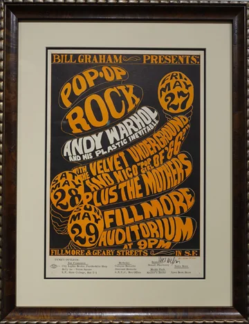
Artist: Wes Wilson, 1966
Fillmore Auditorium, San Francisco
Bands: Velvet Underground with Nico, Frank Zappa, Exploding Plastic Inevitable
Oyster Bay is one of my favorite Long Island towns, a very real, sometimes charming, but never too cute hamlet facing Oyster Bay Harbor on Long Island’s North Shore.
The town is a great mix of the high and low with some beautiful, if neglected, late 19th/early 20th century Main Street commercial architecture.
Vast estates still linger nearby from the Gilded Age, and of course Teddy Roosevelt’s Sagamore Hill, my favorite house museum of all time, is just a few short minutes away (the subject of a later blog).
In the center of town is the the Victorianized mansion Raynham Hall, a restored part of which dates to the mid-18th century showing off its modest Colonial farmhouse roots.
Artist: Stanley Mouse & Alton Kelley, 1966
The Old Cheese Factory
Bands: Grateful Dead, Andrew Staples
There is something interesting to look at around every corner of the town itself.
There are still mom and pop stores sprinkled throughout, a working harbor front with a large park, and a terrific hardware store (Nobman’s Hardware, 95 South Street). There are no chain stores!
The Bahr Gallery adds immensely to that wonderful and lively mix.
Time to mingle after the crowd checks out the posters opening night at the Bahr Gallery.
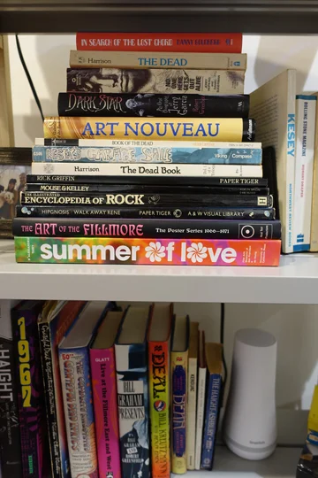
A bookshelf in the Gallery—some “good reads” if you’re so inclined.
Ted took a forlorn shop and storefront on Audrey Avenue facing Oyster Bay Town Hall, and with his interest in historic preservation, transformed it in the simplest, most elegant way, leaving as much of the original store’s architecture and finishes as possible.
When the dropped ceiling was removed, a tin ceiling was revealed that hadn’t seen the light of day in half a century.
The walls and ceilings were painted bright white, gallery lighting installed, and suddenly Ted was looking at a bona fide gallery space, perfect for his collection, and for this next phase of his life.
Artist: Rick Griffin, 1967
Denver Dog, Denver, CO
Bands: The Doors, Allmen Joy, Gingerbread Blu
While preparing for this transition, Ted also tracked down one of his favorite poster artists of the time, Wes Wilson and commissioned him to do a new poster evoking this golden era.
His only request was –“no nudes please.” So what did Ted get from Wes Wilson? A nude—of course. And what color? Psychedelic pink—of course.
When Ted closed his Melville offices, he threw a party to celebrate, and Wilson’s vibrant poster was handed out as a party favor. Alex attended and was the proud recipient of one of these posters. Now framed, it hangs in my office, and I have to say, I love it!
The Psychedelic Nude
“Everybody Is Good At Heart”
Artist: Rick Griffin, 1967
Denver Dog, Denver, CO
Bands: Big Brother & The Holding Company, Blue Cheer, Eight Penny Matter
Detail, “Everybody Is Good At Heart”
Check out all the advertising symbols of the time in this detail! Can you name them?
For the opening of the gallery, Ted engaged a graphic designer friend, Mara Leonardi who was taking photos at the opening last week.
Mara helped Ted with his graphic materials for the gallery, and she also designed buttons for the opening with 60s sayings—“Peace,” “Love,” “Heavy,” “Flower Power”, and of course “Far Out,” to name a few.
There was a big bowl of the buttons as you walked in, right near the twin lava lamps in the front windows. One guest decorated a lapel with a selection of the buttons, to great effect. Yes, you got it— she looked totally “Groovy!”
Post-opening, we headed to 2 Spring across the street, where handsome wood table tops, low light and yellow daffodils in stone vases set the scene.
A psychedelic TR (had they been to the Bahr?) holds sway over an intimate, well-stocked bar. And the food was great too!


